Toolbar


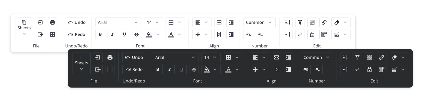
SVAR Toolbar is a Svelte UI component for building flexible button panels, from simple button sets to complex structures with numerous buttons and select boxes. It provides an easy way to organize and display multiple toolbar items, with support for multiline layouts and collapsible item groups that can be shown on demand.
How to Use
To use the toolbar, simply import the package and include the component in your Svelte file:
<script>
    import { Toolbar } from "@svar-ui/svelte-toolbar";

    function onClick(item) {
        message = "Button '" + item.id + "' clicked";
    }

    let items = [
        { id: "label", text: "Toolbar with icon buttons" },
        {
            id: "search",
            comp: "button",
            icon: "wxi-search",
            handler: onClick,
        },
    ];
</script>

<Toolbar {items} />
Svelte 4 and Svelte 5 Versions
There are two versions of the library: the 1.x version, designed to work with Svelte 4, and the 2.x version, created for Svelte 5.
To use the SVAR Toolbar beta for Svelte 5, install it as follows:
npm install @svar-ui/svelte-toolbar
To use the SVAR Toolbar for Svelte 4:
npm install [email protected]
How to Modify
Typically, you don't need to modify the code. However, if you wish to do so, follow these steps:
- Run
yarnto install dependencies. Note that this project is a monorepo usingyarnworkspaces, so npm will not work - Start the project in development mode with
yarn start
Run Tests
To run the test:
- Start the test examples with:
yarn start:tests - In a separate console, run the end-to-end tests with:
yarn test:cypress
