Editor
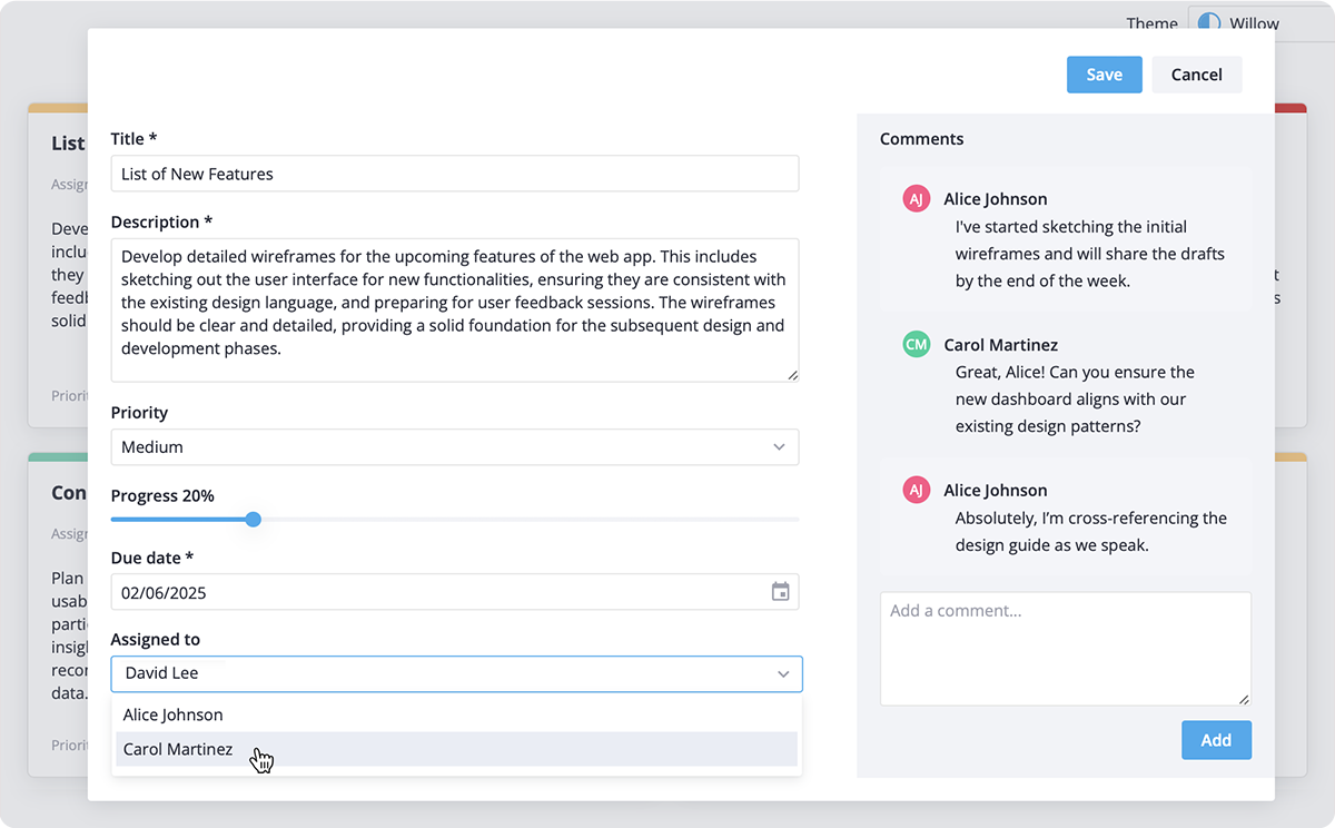
SVAR Editor is a Svelte UI component that helps you build edit forms for structured data.


An intuitive Svelte component for creating content editing forms to manage data within UI elements on a page. You can use it for editing structured data like table rows, informational cards, blocks with text, etc.
:sparkles: Key features:
- Flexible display options: add the editor as a modal popup, inline form or as a seamless sidebar for convenient access.
- Multiple input types: Use various input fields like text inputs, checkboxes, date pickers, sliders, and more controls from SVAR Core library.
- Built-in validation: Includes basic validation for required fields and supports custom validation rules for advanced scenarios.
- Flexible save options: Choose between manual saves, auto-save, or custom saving logic adjusted to your needs.
- Compact layout: Organize forms into expandable sections or a 2-column layout for efficient use of screen space.
- TypeScript support: fully typed for safe and seamless integration.
:hammer_and_wrench: How to Use
To use the Editor widget, simply import the package and include the component in your Svelte file:
<script>
    import { Editor } from "@svar-ui/svelte-editor";

    const value = [];
</script>

<Editor {value} />
For more details, visit the getting started guide.
:wrench: How to Modify
Typically, you don't need to modify the code. However, if you wish to do so, follow these steps:
- Run
yarnto install dependencies. Note that this project is a monorepo usingyarnworkspaces, so npm will not work - Start the project in development mode with
yarn start
:white_check_mark: Run Tests
To run the test:
- Start the test examples with:
yarn start:tests - In a separate console, run the end-to-end tests with:
yarn test:cypress
