Svelte Star Rating
✨ Svelte Star Rating ✨
💻 Project
Simple Svelte component, with no dependencies, for implementing and capturing assessments through a simple and intuitive interface that will take you to the stars.
📦 Installation
$ npm install @ernane/svelte-star-rating # => or yarn
⚠️ if using SvelteKit or Sapper, it is advised to install as a development dependency:
$ npm install @ernane/svelte-star-rating --save-dev # => or yarn
📁 Features
This package will add a svelte component that may or may not receive a configuration object with the following attributes shown below.
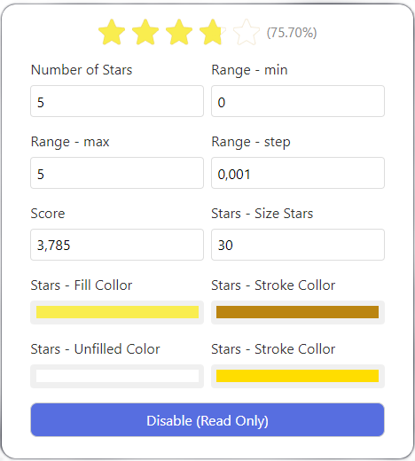
- ⚙️ General Settings
| Attribute | Data Type | Required | Default |
|---|---|---|---|
| readOnly | bool |
false | false |
| countStars | integer |
false | 5 |
| score | float |
false | 0.0 |
| showScore | bool |
false | true |
| scoreFormat | function |
false | precent |
| name | String |
false | "" |
In addition, we have two other nested attributes that specify distinct settings.
- 📏 Range
| Attribute | Data Type | Required | Default |
|---|---|---|---|
| min | integer |
false | 0 |
| max | integer |
false | 5 |
| step | float |
false | 0.001 |
- ⭐ Setting of the Stars:
| Attribute | Data Type | Required | Default |
|---|---|---|---|
| size | integer |
false | 30 |
| fillColor | String |
false | #F9ED4F |
| strokeColor | String |
false | #BB8511 |
| unfilledColor | String |
false | #FFF |
| strokeUnfilledColor | String |
false | #000 |
In the end, the configuration object will be similar to the one shown below.
const config = {
  readOnly: false,
  countStars: 5,
  range: {
    min: 0,
    max: 5,
    step: 0.001
  },
  score: 0.0,
  showScore: true,
  scoreFormat: function(){ return `(${this.score.toFixed(0)}/${this.countStars})` },
  name: "",
  starConfig: {
    size: 30,
    fillColor: '#F9ED4F',
    strokeColor: "#BB8511",
    unfilledColor: '#FFF',
    strokeUnfilledColor: '#000'
  }
}
- 🎯 Events
In addition, it is also possible to observe events of the component itself that will be executed in an internal element from a defined action. Below are the available events.
| Type | Target | Required | Default |
|---|---|---|---|
| change | input.slider |
false | null |
💡 Use
Import the component
import StarRating from "@ernane/svelte-star-rating";Create the configuration object
const config = { ... }**As shown in the previous section
Finally, use it! 🎉
<StarRating {config}/>
If you would like to implement or improve any feature feel free to submit a pull request. I would love to receive!
