Verili
digito
The only framework-agnostic OTP input state machine powering React, Vue, Svelte, Alpine, Vanilla JS, and Web Components from a single core.
By @Olawale Balo — Product Designer + Design Engineer


Overview
Digito is a fully-featured, zero-dependency OTP input library for the web. It handles SMS autofill, password managers, smart paste, screen readers, countdown timers, and resend flows — without requiring you to patch or workaround any of them.
Most OTP libraries render one <input> per slot. This breaks native autofill, confuses screen readers, and creates complex focus-juggling logic. Digito instead renders one transparent input that captures all keyboard and paste events, with purely visual <div> elements mirroring the state. The browser sees a single real field — everything works as expected.
The core is a pure state machine with no DOM or framework dependencies, wrapped by six independent adapters: Vanilla JS, React, Vue, Svelte, Alpine.js, and Web Component.
Features
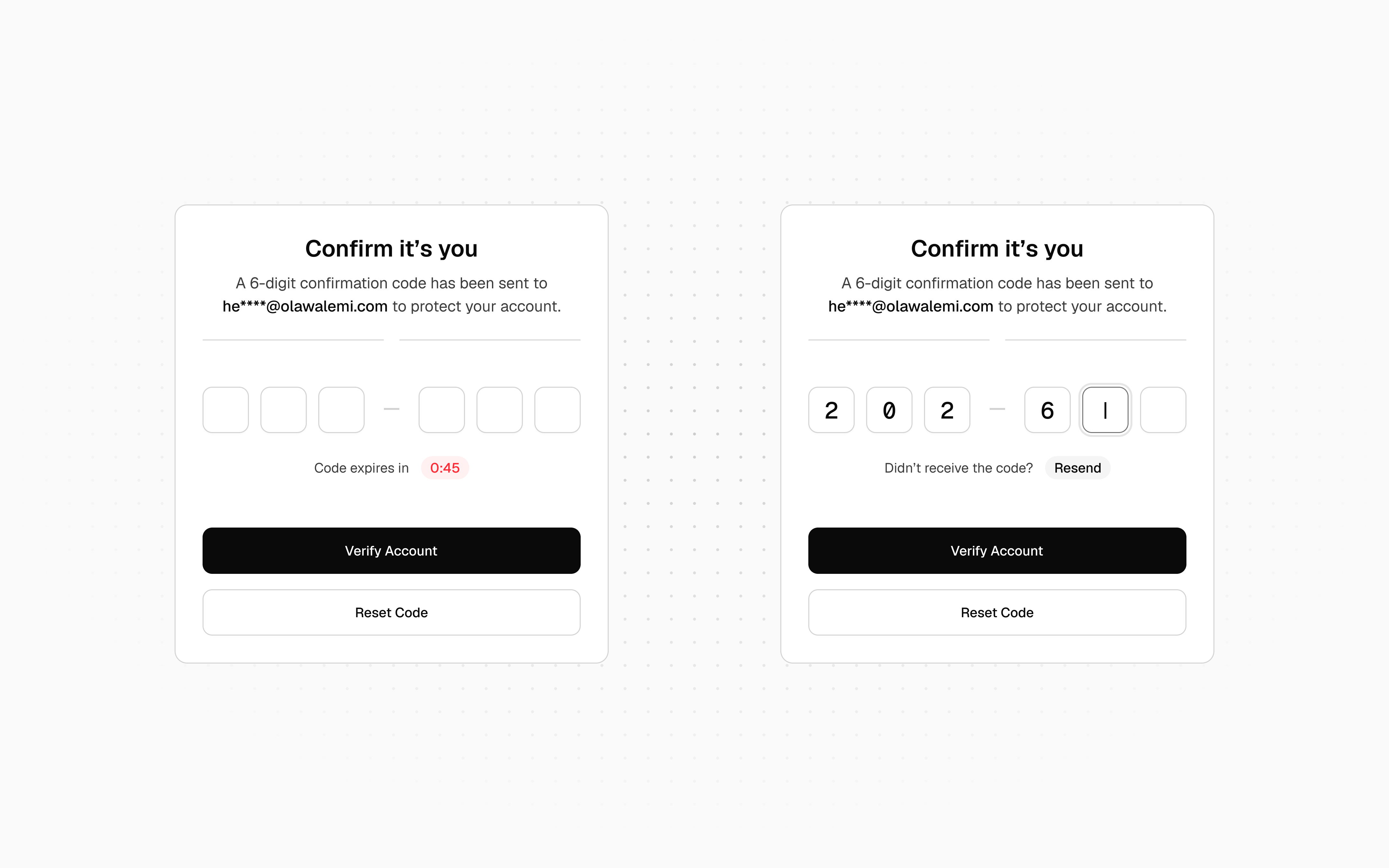
- Single hidden-input architecture — full SMS autofill, password manager, and screen reader support out of the box
- Six framework adapters — Vanilla, React, Vue 3, Svelte, Alpine.js, and Web Component (
<digito-input>) - Zero dependencies — framework peer deps are all optional
- Pure TypeScript — fully typed, ships with declaration maps
- Built-in timer + resend UI — countdown badge and resend button injected automatically, or drive your own with
onTick - Smart paste — distributes valid characters from cursor slot forward, wrapping around if needed
- Password manager guard — detects badges from LastPass, 1Password, Dashlane, Bitwarden, and Keeper; prevents visual overlap automatically
- Web OTP API — intercepts incoming SMS codes on Android Chrome automatically
- Fake caret — blinking caret rendered on the active empty slot for native feel
- Masked mode —
masked: truerenders●glyphs and setstype="password"on the hidden input - Visual separators —
separatorAftergroups slots visually (e.g.XXX — XXX) without affecting the value - Custom charset —
pattern: RegExpoverridestypefor any per-character validation rule - Haptic + sound feedback —
navigator.vibrateand Web Audio API on completion and error onCompletedeferral — fires after DOM sync; cancellable without clearing slot values- Native form support —
nameoption wires the hidden input into<form>/FormData - Fully accessible — single ARIA-labelled input,
inputMode,autocomplete="one-time-code", all visual elementsaria-hidden - CDN-ready — two IIFE bundles for no-build usage
How digito compares
| Feature | digito | input-otp | react-otp-input |
|---|---|---|---|
| Pure headless state machine | ✅ | ✗ | ✗ |
| Web OTP API (SMS intercept) | ✅ | ✗ | ✗ |
| Built-in styles | ✅ | ✗ | ✗ |
| Built-in timer + resend | ✅ | ✗ | ✗ |
| Masked mode | ✅ | ✗ | ✗ |
| Visual separators | ✅ | ✗ | ✗ |
Programmatic API (setError, setSuccess, reset, focus) |
✅ | ✗ | ✗ |
| Haptic + sound feedback | ✅ | ✗ | ✗ |
blurOnComplete (auto-advance) |
✅ | ✗ | ✗ |
onInvalidChar callback |
✅ | ✗ | ✗ |
| Vanilla JS | ✅ | ✗ | ✗ |
| Vue | ✅ | ✗ | ✗ |
| Svelte | ✅ | ✗ | ✗ |
| Alpine.js | ✅ | ✗ | ✗ |
| Web Component | ✅ | ✗ | ✗ |
| Single hidden input | ✅ | ✅ | ✗ |
| Fake caret | ✅ | ✅ | ✗ |
| Password manager guard | ✅ | ✅ | ✗ |
| React | ✅ | ✅ | ✅ |
| Zero dependencies | ✅ | ✅ | ✗ |
| TypeScript | ✅ | ✅ | ✅ |
Installation
npm i digito
# or
pnpm add digito
# or
yarn add digito
CDN (no build step):
<!-- Vanilla JS — window.Digito global -->
<script src="https://unpkg.com/digito/dist/digito.min.js"></script>

<!-- Web Component — auto-registers <digito-input> -->
<script src="https://unpkg.com/digito/dist/digito-wc.min.js"></script>
Quick Start
Vanilla JS — add a <div> and call initDigito():
<div class="digito-wrapper" data-length="6" data-timer="60"></div>

<script type="module">
  import { initDigito } from 'digito'

  const [otp] = initDigito('.digito-wrapper', {
    onComplete: (code) => console.log('Code:', code),
    onResend:   () => sendOTP(),
  })
</script>
Digito injects the slot inputs, styles, countdown badge, and resend button automatically. Nothing else to configure.
Usage
Common Patterns
| Pattern | Key options |
|---|---|
| SMS / email OTP (6-digit numeric) | type: 'numeric', timer: 60, onResend |
| 2FA / TOTP with grouping | separatorAfter: 3 |
| PIN entry (hidden) | masked: true, blurOnComplete: true |
| Alphanumeric verification code | type: 'alphanumeric', pasteTransformer |
| Invite / referral code (grouped) | separatorAfter: [3, 6], pattern: /^[A-Z0-9]$/ |
| Activation key (hex charset) | pattern: /^[0-9A-F]$/, separatorAfter: [5, 10, 15] |
| Native form submission | name: 'otp_code' |
| Async verification with lock | setDisabled(true/false) around API call |
| Auto-advance after entry | blurOnComplete: true |
Vanilla JS
<div
  class="digito-wrapper"
  data-length="6"
  data-type="numeric"
  data-timer="60"
  data-resend="30"
></div>

<script type="module">
  import { initDigito } from 'digito'

  const [otp] = initDigito('.digito-wrapper', {
    onComplete: (code) => verify(code),
    onResend:   () => sendOTP(),
  })

  // Instance API
  otp.getCode()           // → "123456"
  otp.reset()             // clear all slots, restart timer, re-focus
  otp.setError(true)      // red ring on all slots
  otp.setSuccess(true)    // green ring on all slots
  otp.setDisabled(true)   // lock input during async verification
  otp.destroy()           // clean up all event listeners
</script>
Custom timer UI — pass onTick to suppress the built-in footer and drive your own:
const [otp] = initDigito('.digito-wrapper', {
  timer:    60,
  onTick:   (remaining) => (timerEl.textContent = `0:${String(remaining).padStart(2, '0')}`),
  onExpire: () => showResendButton(),
  onResend: () => { otp.resend(); hideResendButton() },
})
React
import { useOTP, HiddenOTPInput } from 'digito/react'

export function OTPInput() {
  const otp = useOTP({
    length:     6,
    onComplete: (code) => verify(code),
  })

  return (
    <div style={{ position: 'relative', display: 'inline-flex', gap: 10 }}>
      <HiddenOTPInput {...otp.hiddenInputProps} />

      {otp.slotValues.map((_, i) => {
        const { char, isActive, isFilled, isError, hasFakeCaret } = otp.getSlotProps(i)
        return (
          <div
            key={i}
            className={[
              'slot',
              isActive  ? 'is-active'  : '',
              isFilled  ? 'is-filled'  : '',
              isError   ? 'is-error'   : '',
            ].filter(Boolean).join(' ')}
          >
            {hasFakeCaret && <span className="caret" />}
            {char}
          </div>
        )
      })}
    </div>
  )
}
Controlled / react-hook-form:
const [code, setCode] = useState('')
const otp = useOTP({ length: 6, value: code, onChange: setCode })
Vue 3
<script setup lang="ts">
import { useOTP } from 'digito/vue'

const otp = useOTP({ length: 6, onComplete: (code) => verify(code) })
</script>

<template>
  <div style="position: relative; display: inline-flex; gap: 10px">
    <input
      :ref="(el) => (otp.inputRef.value = el as HTMLInputElement)"
      v-bind="otp.hiddenInputAttrs"
      style="position: absolute; inset: 0; opacity: 0; z-index: 1"
      @keydown="otp.onKeydown"
      @input="otp.onChange"
      @paste="otp.onPaste"
      @focus="otp.onFocus"
      @blur="otp.onBlur"
    />
    <div
      v-for="(char, i) in otp.slotValues.value"
      :key="i"
      class="slot"
      :class="{
        'is-active':  i === otp.activeSlot.value && otp.isFocused.value,
        'is-filled':  !!char,
        'is-error':   otp.hasError.value,
      }"
    >
      {{ char }}
    </div>
  </div>
</template>
Reactive controlled value:
const code = ref('')
const otp  = useOTP({ length: 6, value: code })
code.value = ''  // resets the field reactively
Svelte
<script>
  import { useOTP } from 'digito/svelte'

  const otp = useOTP({ length: 6, onComplete: (code) => verify(code) })
</script>

<div style="position: relative; display: inline-flex; gap: 10px">
  <input
    use:otp.action
    style="position: absolute; inset: 0; opacity: 0; z-index: 1"
  />

  {#each $otp.slotValues as char, i}
    <div
      class="slot"
      class:is-active={i === $otp.activeSlot}
      class:is-filled={!!char}
      class:is-error={$otp.hasError}
    >
      {char}
    </div>
  {/each}
</div>
Alpine.js
import Alpine from 'alpinejs'
import { DigitoAlpine } from 'digito/alpine'

Alpine.plugin(DigitoAlpine)
Alpine.start()
<div x-digito="{
  length: 6,
  timer: 60,
  onComplete(code) { verify(code) },
  onResend()       { sendOTP()   },
}"></div>
Access the instance API via el._digito:
const el = document.querySelector('[x-digito]')
el._digito.getCode()
el._digito.setError(true)
el._digito.reset()
Web Component
import 'digito/web-component'
<digito-input
  length="6"
  type="numeric"
  timer="60"
  placeholder="·"
  separator-after="3"
  name="otp_code"
></digito-input>

<script>
  const el = document.querySelector('digito-input')

  // JS-only options (cannot be HTML attributes)
  el.pattern          = /^[A-Z0-9]$/
  el.pasteTransformer = s => s.toUpperCase()
  el.onComplete       = code => verify(code)
  el.onResend         = () => sendOTP()

  // DOM events (bubbles + composed)
  el.addEventListener('complete', e => console.log(e.detail.code))
  el.addEventListener('expire', () => showResendButton())
  el.addEventListener('change', e => console.log(e.detail.code))

  // DOM API
  el.reset()
  el.setError(true)
  el.getCode()
</script>
API Reference
initDigito(target?, options?) — Vanilla
Mounts Digito on one or more wrapper elements. Returns an array of DigitoInstance.
initDigito(target?: string | HTMLElement | HTMLElement[], options?: VanillaOptions): DigitoInstance[]
DigitoInstance methods:
| Method | Description |
|---|---|
getCode() |
Returns the current joined code string |
reset() |
Clears all slots, restarts timer, re-focuses |
resend() |
reset() + fires onResend |
setError(bool) |
Applies or clears error state on all slots |
setSuccess(bool) |
Applies or clears success state on all slots |
setDisabled(bool) |
Disables or enables all input; navigation always allowed |
focus(slotIndex) |
Programmatically moves focus to a slot |
destroy() |
Removes all event listeners, stops timer, aborts Web OTP request |
useOTP(options) — React
import { useOTP, HiddenOTPInput } from 'digito/react'
const otp = useOTP(options)
Returns:
| Property | Type | Description |
|---|---|---|
hiddenInputProps |
object |
Spread onto the <input> or use <HiddenOTPInput> |
slotValues |
string[] |
Current character per slot ('' = empty) |
activeSlot |
number |
Zero-based index of the focused slot |
isComplete |
boolean |
All slots filled |
hasError |
boolean |
Error state active |
isDisabled |
boolean |
Disabled state active |
isFocused |
boolean |
Hidden input has browser focus |
timerSeconds |
number |
Remaining countdown seconds |
getSlotProps(i) |
(number) => SlotRenderProps |
Full render metadata for slot i |
getCode() |
() => string |
Joined code string |
reset() |
() => void |
Clear all slots, restart timer |
setError(bool) |
(boolean) => void |
Toggle error state |
setDisabled(bool) |
(boolean) => void |
Toggle disabled state |
focus(i) |
(number) => void |
Move focus to slot |
SlotRenderProps (from getSlotProps(i)):
| Prop | Type | Description |
|---|---|---|
char |
string |
Slot character, '' when unfilled |
index |
number |
Zero-based slot index |
isActive |
boolean |
This slot has visual focus |
isFilled |
boolean |
Slot contains a character |
isError |
boolean |
Error state active |
isComplete |
boolean |
All slots filled |
isDisabled |
boolean |
Input is disabled |
isFocused |
boolean |
Hidden input has browser focus |
hasFakeCaret |
boolean |
isActive && !isFilled && isFocused |
masked |
boolean |
Masked mode active |
maskChar |
string |
Configured mask glyph |
placeholder |
string |
Configured placeholder character |
HiddenOTPInput — forwardRef wrapper that applies absolute-positioning styles automatically.
useOTP(options) — Vue 3
import { useOTP } from 'digito/vue'
const otp = useOTP(options)
Returns:
| Property | Type | Description |
|---|---|---|
hiddenInputAttrs |
object |
Bind with v-bind |
inputRef |
Ref<HTMLInputElement | null> |
Bind with :ref |
slotValues |
Ref<string[]> |
Current slot values |
activeSlot |
Ref<number> |
Focused slot index |
value |
Ref<string> |
Computed joined code |
isComplete |
Ref<boolean> |
All slots filled |
hasError |
Ref<boolean> |
Error state |
isFocused |
Ref<boolean> |
Hidden input focused |
timerSeconds |
Ref<number> |
Remaining countdown |
masked |
Ref<boolean> |
Masked mode active |
onKeydown |
handler | Bind with @keydown |
onChange |
handler | Bind with @input |
onPaste |
handler | Bind with @paste |
onFocus |
handler | Bind with @focus |
onBlur |
handler | Bind with @blur |
getCode() |
() => string |
Joined code |
reset() |
() => void |
Clear and reset |
setError(bool) |
(boolean) => void |
Toggle error |
focus(i) |
(number) => void |
Move focus |
value also accepts Ref<string> — assigning it resets the field reactively without firing onComplete.
useOTP(options) — Svelte
import { useOTP } from 'digito/svelte'
const otp = useOTP(options)
Returns:
| Property | Type | Description |
|---|---|---|
subscribe |
Store | Subscribe to full OTP state |
action |
Svelte action | Use with use:otp.action on the hidden <input> |
value |
Derived store | Joined code string |
isComplete |
Derived store | All slots filled |
hasError |
Derived store | Error state |
activeSlot |
Derived store | Focused slot index |
timerSeconds |
Writable store | Remaining countdown |
masked |
Writable store | Masked mode |
getCode() |
() => string |
Joined code |
reset() |
() => void |
Clear and reset |
setError(bool) |
(boolean) => void |
Toggle error |
setValue(v) |
(string) => void |
Programmatic fill without triggering onComplete |
focus(i) |
(number) => void |
Move focus |
createDigito(options) — Core (headless)
Pure state machine with no DOM or framework dependency.
import { createDigito } from 'digito/core'

const otp = createDigito({ length: 6, type: 'numeric' })

// Input actions
otp.inputChar(slotIndex, char)
otp.deleteChar(slotIndex)
otp.pasteString(cursorSlot, rawText)
otp.moveFocusLeft(pos)
otp.moveFocusRight(pos)
otp.moveFocusTo(index)

// State control
otp.setError(bool)
otp.resetState()
otp.setDisabled(bool)
otp.cancelPendingComplete()  // cancel onComplete without clearing slots

// Query
otp.state        // DigitoState snapshot
otp.getCode()
otp.getSnapshot()

// Subscription (XState/Zustand-style)
const unsub = otp.subscribe(state => render(state))
unsub()
createTimer(options) — Standalone
import { createTimer } from 'digito'

const timer = createTimer({
  totalSeconds: 60,
  onTick:   (remaining) => updateUI(remaining),
  onExpire: () => showResendButton(),
})

timer.start()    // begin countdown
timer.stop()     // pause
timer.reset()    // restore to totalSeconds without restarting
timer.restart()  // reset + start
If totalSeconds <= 0, onExpire fires immediately on start(). start() is idempotent — calling it twice never double-ticks.
filterChar / filterString — Utilities
import { filterChar, filterString } from 'digito'

filterChar('A', 'numeric')          // → '' (rejected)
filterChar('5', 'numeric')          // → '5'
filterChar('A', 'alphanumeric')     // → 'A'
filterChar('Z', 'any', /^[A-Z]$/)  // → 'Z' (pattern overrides type)

filterString('84AB91', 'numeric')   // → '8491'
Configuration Options
All options are accepted by every adapter unless otherwise noted.
| Option | Type | Default | Description |
|---|---|---|---|
length |
number |
6 |
Number of input slots |
type |
'numeric' | 'alphabet' | 'alphanumeric' | 'any' |
'numeric' |
Character class |
pattern |
RegExp |
— | Per-character regex; overrides type for validation |
pasteTransformer |
(raw: string) => string |
— | Transforms clipboard text before filtering |
onComplete |
(code: string) => void |
— | Fired when all slots are filled |
onExpire |
() => void |
— | Fired when countdown reaches zero |
onResend |
() => void |
— | Fired when resend is triggered |
onTick |
(remaining: number) => void |
— | Fired every second; suppresses built-in footer (vanilla) |
onInvalidChar |
(char: string, index: number) => void |
— | Fired when a typed character is rejected |
onChange |
(code: string) => void |
— | Fired on every user interaction |
onFocus |
() => void |
— | Fired when hidden input gains focus |
onBlur |
() => void |
— | Fired when hidden input loses focus |
timer |
number |
0 |
Countdown duration in seconds (0 = disabled) |
resendAfter |
number |
30 |
Resend button cooldown in seconds (vanilla) |
autoFocus |
boolean |
true |
Focus the hidden input on mount |
blurOnComplete |
boolean |
false |
Blur on completion (auto-advance to next field) |
selectOnFocus |
boolean |
false |
Select-and-replace behavior on focused filled slot |
placeholder |
string |
'' |
Character shown in empty slots (e.g. '○', '_') |
masked |
boolean |
false |
Render maskChar in slots; type="password" on hidden input |
maskChar |
string |
'●' |
Glyph used in masked mode |
name |
string |
— | Hidden input name for <form> / FormData |
separatorAfter |
number | number[] |
— | 1-based slot index/indices to insert a visual separator after |
separator |
string |
'—' |
Separator character to render |
disabled |
boolean |
false |
Disable all input on mount |
haptic |
boolean |
true |
navigator.vibrate(10) on completion and error |
sound |
boolean |
false |
Play 880 Hz tone via Web Audio on completion |
Styling & Customization
CSS Custom Properties
Set on .digito-wrapper (vanilla) or digito-input (web component) to theme the entire component:
.digito-wrapper {
  /* Dimensions */
  --digito-size:          56px;     /* slot width + height    */
  --digito-gap:           12px;     /* gap between slots      */
  --digito-radius:        10px;     /* slot border radius     */
  --digito-font-size:     24px;     /* digit font size        */

  /* Colors */
  --digito-color:         #0A0A0A;  /* digit text color       */
  --digito-bg:            #FAFAFA;  /* empty slot background  */
  --digito-bg-filled:     #FFFFFF;  /* filled slot background */
  --digito-border-color:  #E5E5E5;  /* default slot border    */
  --digito-active-color:  #3D3D3D;  /* active border + ring   */
  --digito-error-color:   #FB2C36;  /* error border + ring    */
  --digito-success-color: #00C950;  /* success border + ring  */
  --digito-caret-color:   #3D3D3D;  /* fake caret color       */
  --digito-timer-color:   #5C5C5C;  /* footer text            */

  /* Placeholder & separator */
  --digito-placeholder-color: #D3D3D3;
  --digito-placeholder-size:  16px;
  --digito-separator-color:   #A1A1A1;
  --digito-separator-size:    18px;
}
CSS Classes (Vanilla & Web Component)
| Class | Applied when |
|---|---|
.digito-slot |
Always — on every visual slot div |
.digito-slot.is-active |
Slot is the currently focused position |
.digito-slot.is-filled |
Slot contains a character |
.digito-slot.is-error |
Error state is active |
.digito-slot.is-success |
Success state is active |
.digito-caret |
The blinking caret inside the active empty slot |
.digito-footer |
The "Code expires in…" countdown row |
.digito-timer-badge |
The red pill countdown badge |
.digito-resend-row |
The "Didn't receive the code?" resend row |
.digito-resend-btn |
The resend chip button |
.digito-separator |
The visual separator between slot groups |
Accessibility
Digito is built with accessibility as a first-class concern:
- Single ARIA-labelled input — the hidden input carries
aria-label="Enter your N-digit code"(orN-character codefor non-numeric types). Screen readers announce one field, not six. - All visual elements
aria-hidden— slot divs, separators, caret, and timer footer are hidden from the accessibility tree. inputMode— set to"numeric"or"text"based ontype, triggering the correct mobile keyboard.autocomplete="one-time-code"— enables native SMS autofill on iOS and Android.- Anti-interference —
spellcheck="false",autocorrect="off",autocapitalize="off"prevent browser UI from interfering. maxLength— constrains native input tolength.type="password"in masked mode — triggers the OS password keyboard on mobile.- Native form integration — the
nameoption wires the hidden input into<form>andFormData, compatible with any form submission approach. - Keyboard navigation — full keyboard support (
←,→,Backspace,Tab). No mouse required.
Keyboard Navigation
| Key | Action |
|---|---|
0–9 / a–z / A–Z |
Fill current slot and advance focus |
Backspace |
Clear current slot; step back if already empty |
← |
Move focus one slot left |
→ |
Move focus one slot right |
Cmd/Ctrl+V |
Smart paste from cursor slot, wrapping if needed |
Tab |
Standard browser tab order |
Browser & Environment Support
Browsers:
| Browser | Support |
|---|---|
| Chrome / Edge | ✅ Full support including Web OTP API |
| Firefox | ✅ Full support |
| Safari / iOS Safari | ✅ Full support including SMS autofill |
| Android Chrome | ✅ Full support including Web OTP API |
Frameworks (peer deps, all optional):
| Framework | Version |
|---|---|
| React | >= 17 |
| Vue | >= 3 |
| Svelte | >= 4 |
| Alpine.js | >= 3 |
Runtimes:
- Node.js (core state machine — no DOM required)
- All modern browsers
- CDN / no-build via IIFE bundles (ES2017 target)
Package Exports
digito                → Vanilla JS adapter + core utilities
digito/core           → createDigito, createTimer, filterChar, filterString (no DOM)
digito/react          → useOTP hook + HiddenOTPInput + SlotRenderProps
digito/vue            → useOTP composable
digito/svelte         → useOTP store + action
digito/alpine         → DigitoAlpine plugin
digito/web-component  → <digito-input> custom element
All exports are fully typed. Core utilities are also available from the main entry:
import { createDigito, createTimer, filterChar, filterString } from 'digito'
License
MIT © Olawale Balo
