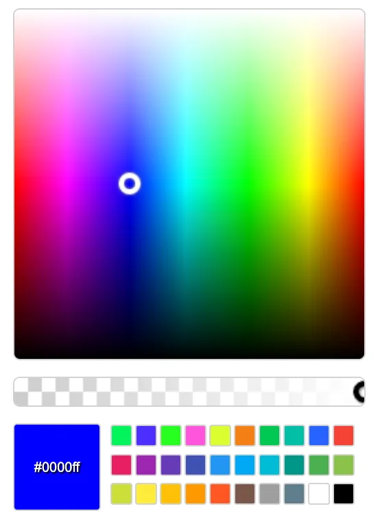
easy-color-picker
Implement this simple and lightweight color picker specifically for Svelte without any dependencies, maintaining a small package footprint. Easily obtain the color value by utilizing the on:change event for the picker. Simply add it to any component. It will work well on mobile devices also.
Install
npm install @cloudparker/easy-color-picker-svelte -D
Screenshot

Sample
<script lang="ts">
    import EasyColorPicker from '@cloudparker/easy-color-picker-svelte';
    //...

    const handleColor = (color:string) => {
        console.log(color);
    };
</script>

<EasyColorPicker
color="#ff0000"
onColor={handleColor}
colorPalletes={['#f57f17', '#00c853', '#00bfa5', '#2962ff']}
>
</EasyColorPicker>
Demo
NA
Props
color: string
default: #0000ff Bind the color value in hex format.
colorPalletes: string[]
Set colors for quick access, can set max 4 colors into it.
Events
onColor
Tigger with the color value rgb or rgba or hex format when color changed.