Svelte Gallery
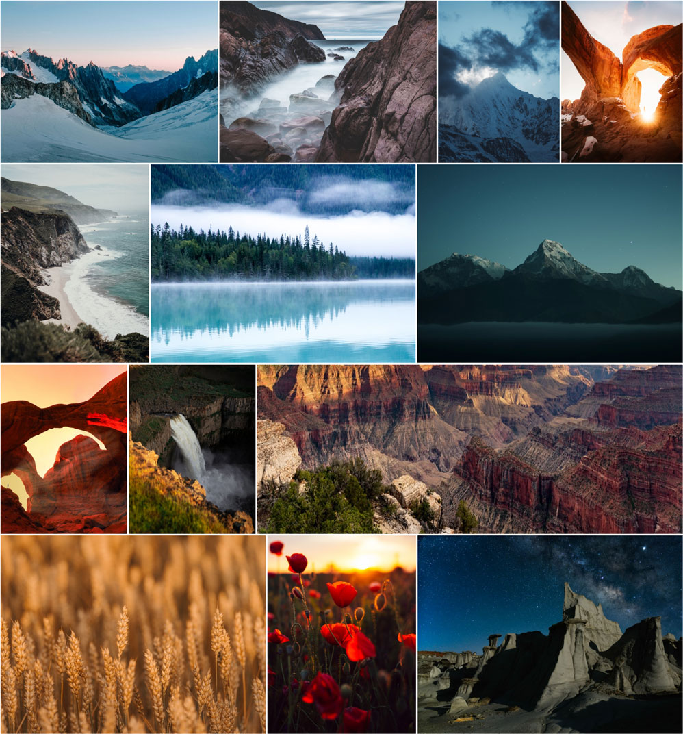
Intelligent masonry style photo gallery that maintains image aspect ratios in perfect rows
Svelte Gallery


Intelligent masonry-style photo gallery that maintains image aspect ratios in perfect rows. Svelte gallery analyses a graph of all possible row combinations to find the ideal gallery layout based on a target row height.
Originally forked from fergaldoyle/image-masonry, svelte-gallery is a full rewrite taking the core layout logic and focussing on an updated, maintained svelte implementation.
Usage
npm i svelte-gallery
<script>
  import Gallery from 'svelte-gallery';

  const images = [
    { src: 'https://source.unsplash.com/random', width: 600, height: 400 },
    { src: 'https://source.unsplash.com/random', width: 400, height: 600 },
    { src: 'https://source.unsplash.com/random', width: 800, height: 1200 },
    { src: 'https://source.unsplash.com/random', width: 300, height: 200 }
  ];
</script>

<Gallery {images} />
Properties
| Property | Description | Type | Default |
|---|---|---|---|
images |
Images to display. Must (native) width and height values |
HTMLImageElement[] |
[] |
rowHeight |
Ideal row height to aim for in px | number |
220 |
gutter |
Gap between images in the gallery in px | number |
8 |
imageComponent |
Optional custom image component, passed all props in images array |
SvelteComponent |
img |
