@bewinxed/wallet-adapter-svelte-ui
This is a direct port of anza-xyz/wallet-adapter to Svelte 5 (Will not support older versions).
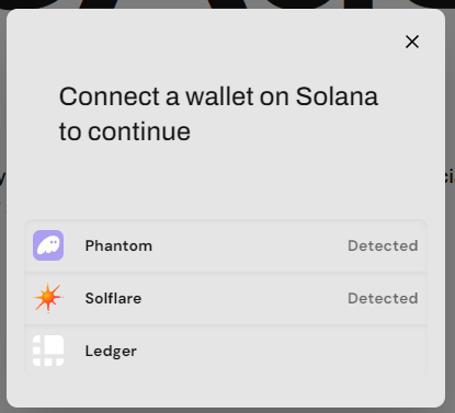
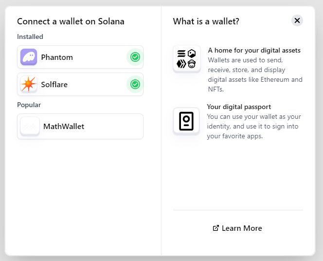
With (IMO) better UI, Accessibility, and Performance.
Requirements
Note: Svelte 5 & TailwindCSS are required!
Installation
Make sure you install the Wallet Adapter first.
npm install @bewinxed/wallet-adapter-svelte-ui
pnpm add @bewinxed/wallet-adapter-svelte-ui
bun add @bewinxed/wallet-adapter-svelte-ui
Setup
Add the connection/wallet/modal providers into your main layout.
<script lang="ts">
    import { ConnectionProvider, WalletProvider } from '@bewinxed/wallet-adapter-svelte';
    import { WalletModalProvider, WalletMultiButton } from '@bewinxed/wallet-adapter-svelte-ui';
    import { Connection, PublicKey } from '@solana/web3.js';
    import { onMount } from 'svelte';
</script>

<ConnectionProvider config={{endpoint: 'https://api.mainnet-beta.solana.com'}}>
    <WalletProvider wallets={[]}>
        <WalletModalProvider>
            <WalletMultiButton />
        </WalletModalProvider>
    </WalletProvider>
</ConnectionProvider>
Context
The connection and wallet data are available in one rune, useSolana().
<script lang="ts">
    import { useSolana } from '@bewinxed/wallet-adapter-svelte';

    const solana = useSolana();
    const {connection, context} = $derived(solana);
</script>

{#if context.wallet}
    {context.wallet.publicKey}
{/if}
Events
Multiple helpful event types have been exposed on the WalletProvider and WalletModalProvider, as well as the WalletMultiButton.
WalletProvider
- onconnect
- ondisconnect
- onerror
WalletModalProvider
- onopen
- onclose
WalletMultiButton
- onconnect
- ondisconnect
- onselectwallet
- ...all HTML button props/handlers.
Changes/Fixes vs Wallet Adapter & Svelte-On-Solana
- Wallets are auto detected now, no need to add them separately.
- Updates in line with the React version (With much cleanup because react).
- No svelte stores needed, all done with runes now.
- Better UI (Styled with tailwind, CSS later if asked.)
- Accessibility (Keyboard navigation, focus management, etc.)
Customization
- You can pass classes/styles to the buttons now, making it easier to customize the button for your app vs fiddling with global CSS styles.
<WalletMultiButton class="bg-red-500 text-white rounded-full p-2" />
Note: The buttons have helpful attributes for styling, such as square and flat.
| Attribute | Description |
| --- | --- |
| square | Removes border radius.
| flat | Removes shadows.
| headless | Removes all styling from the button, then you can pass your own styles.
CSS Variables (Will work next version)
You can use the following CSS variables to customize the WalletAdapter Svelte UI.
| Variable | Description |
| --- | --- |
| --solana-primary | Primary color for the WalletAdapter Svelte UI.
| --solana-primary-light | Lighter primary color for the WalletAdapter Svelte UI.
| --solana-secondary | Secondary color for the WalletAdapter Svelte UI.
| --solana-secondary-light | Lighter secondary color for the WalletAdapter Svelte UI.
| --solana-accent | Accent color for the WalletAdapter Svelte UI.
| --solana-accent-light | Lighter accent color for the WalletAdapter Svelte UI.
| --solana-backdrop | Backdrop color for the WalletAdapter Svelte UI.
Comparison
Better Modal UI, Native modal on mobile.
Next up.
- Add helpful utilities to generate messages/transactions/send transactions.
- UI polishes.
- Make sure Anchor works.
- Migrate to @solana/web3.js 2.* experimental.

